
Access to the University of Lethbridge Logo
OUR SUN LOGO
Our logo brings together the sun and the tipi, both central to our story and values. Radiating beams symbolize the sun and four keystone poles form the tipi’s strong foundation, representing stability, support and collective strength. The open view to the sky invites perspective, aspiration and shared learning.
Our logo is available in two variants: landscape and portrait. The landscape version serves as our primary mark and should be used whenever possible for maximum clarity and recognition. The portrait version offers flexibility for vertical formats or layouts where space is limited.
Under no circumstances should our logo be cropped to isolate the sun symbol.


REQUEST ACCESS
Our logos serve as the University's primary visual identifier and are reserved for official institutional communications.
Students & Staff
Staff, Faculty, and students can directly access our logos for download.
External Users
Individuals not affiliated with the University of Lethbridge can request logo access.
USING OUR LOGO
Colourways
To ensure clarity and consistency, we have limited the logo to a small set of approved colours:
- Full-Colour Version: our primary logo with our two core colours (midnight blue and sun yellow).
- Single-Colour Version: A simplified option designed for flexibility across different backgrounds.
- Black Version: For use in strictly monochromatic applications where colour use is not possible.


Spacing
To ensure our logo is always presented with clarity and impact, adequate space must be maintained around it. Please refer to the clearance guides shown below for the required minimum clear space on both the landscape and portrait versions of our logo. This space, which is equal to the height of the capital L in Lethbridge, acts as a protective buffer, ensuring the logo remains unobstructed by text, images or other graphic elements.
Minimum Size
Legibility is critical to maintaining the integrity of our brand. For this reason, we have a minimum size requirement for our logo. This is the smallest size at which the logo can be reproduced while remaining clear and readable. Please note that this is an absolute minimum—wherever possible, use a larger size to ensure optimal visibility and brand impact.
Landscape version: 0.5 inch / 50px minimum height
Portrait version: 0.875 inch / 90px minimum height

Logo Dos & Don’ts
Please keep these considerations in mind when using our logo.
Image

Do not rotate logo | Image

Do not reorder or adjust the position of components within the logo |
Image
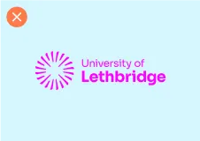
Do not recolour the logo | Image

Do not outline the logo |
Image

Do not replace the text component of the logo | Image

Do not stretch or distort the logo |
Image

Do not add graphic elements to the logo | Image

Do not use gradients within the logo |
Image

Do not use drop shadows or other effects on the logo | Image

Do not crop the logo |
Image

Do not use logo on imagery that makes it difficult to read | Image

Do not use low contrast colour pairings with the logo |
Logo Dos & Don’ts
Please keep these considerations in mind when using our logo.
Image
Do not rotate logo | Image
Do not reorder or adjust the position of components within the logo | Image
Do not recolour the logo | Image
Do not outline the logo |
Image
Do not replace the text component of the logo | Image
Do not stretch or distort the logo | Image
Do not add graphic elements to the logo | Image
Do not use gradients within the logo |
Image
Do not use drop shadows or other effects on the logo | Image
Do not crop the logo | Image
Do not use logo on imagery that makes it difficult to read | Image
Do not use low contrast colour pairings with the logo |
Questions?
If you have questions about the University’s brand, including how to access or use the University logo and other brand resources, please contact the Brand Team. The Brand Team can help answer questions about using the brand correctly and accessing available resources.